Brand guidelines
Warm, clear, and built for trust. Official colors, typography, logo usage, and downloadable assets for partners, media, and internal teams.
Brand essence
Consistent brand use helps people recognize Ardent Africa and trust the platform behind every campaign.
Ardent Africa connects people who care with causes that matter across the continent. Our brand should feel confident and human: structured enough for enterprise use, warm enough for community storytelling.
Use these guidelines when you represent Ardent Africa in product UI, marketing, email, presentations, or partner materials. When in doubt, favor clarity, restraint, and our navy and gold palette over decorative effects.
Color palette
Core colors used across the public platform, admin console, mobile app, and transactional email.
Navy
#1B3C53
Primary brand color. Headlines, navigation, key actions, and dark surfaces.
Slate navy
#25343f
Top utility bar on the public platform (announcements and quick links). Pair with light text and gold accents.
Gold
#DDBA7D
Accent color. Highlights, secondary buttons, icons, and focus states.
White
#FFFFFF
Primary page background and text on navy surfaces.
Cream (surface)
#F5E7C6
Cards, panels, and warm section backgrounds in product UI.
Cream (soft)
#FDF6E9
Email backgrounds, auth panels, and soft marketing sections.
Body text
#334443
Paragraphs, labels, and long-form reading on light backgrounds.
Extended UI colors
Navy hover
#152E42
Primary button hover and pressed states.
Gold dark
#C9A56B
Gold button hover and subtle emphasis.
Success
#2E7D5B
Confirmations and positive status only. Not a brand accent.
Error
#B54A4A
Errors and destructive actions. Use sparingly.
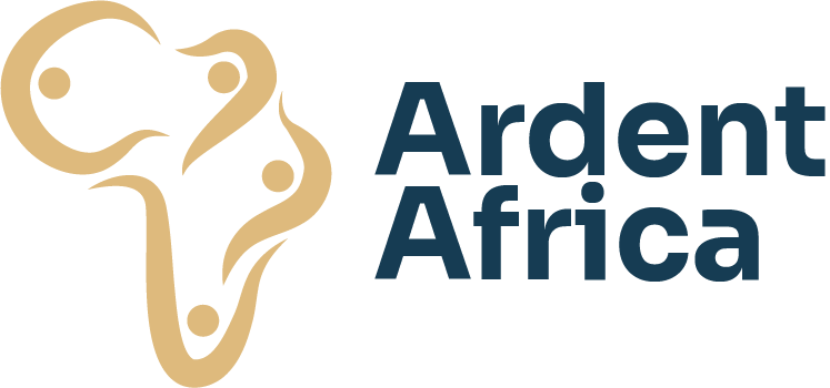
Logo
The Ardent Africa lockup combines a human-centered Africa mark with the wordmark. Always use approved files. Minimum display height: 32px.
Light background lockup

Use on white, cream (#F5E7C6, #FDF6E9), and other light surfaces. This is the default logo across the public platform.
Dark background lockup
Use on navy (#1B3C53), slate navy (#25343f), footer navy (#0d1f2b), and other dark surfaces. Includes gold icon and white wordmark.
Do
Use the provided PNG lockups. Do not recreate the mark from scratch.
Place the logo on navy, cream, or white backgrounds that meet contrast requirements.
Scale proportionally. Maintain the built-in aspect ratio.
Use the dark lockup on photography only when a solid navy overlay preserves legibility.
Do not
Do not stretch, rotate, skew, or add effects (shadows, glows, outlines) to the logo.
Do not change logo colors or swap gold and white elements.
Do not place the light lockup on busy or low-contrast backgrounds.
Do not use unapproved gradients, purple tones, or generic stock icon sets in Ardent materials.
Typography
Sora for headings. Manrope for body copy, labels, and buttons. Both are loaded via Google Fonts in our web apps.
Empower communities across Africa
Campaigns that create real impact
Verified causes you can trust
Ardent Africa helps individuals, NGOs, and corporates raise funds, gather support, and report outcomes with transparency.
Start a campaign
Voice and tone
Product copy, campaigns, and partner communications should sound like Ardent Africa: grounded, inclusive, and precise.
Clear over clever
Write in plain language. Explain what happens next. Avoid jargon unless your audience expects it.
Warm and respectful
Celebrate community impact without hype. Treat donors, creators, and partners with equal seriousness.
Trust through transparency
Lead with verifiable facts, fees, and outcomes. Never overpromise impact or hide platform rules.
Preferred language
Avoid
UI principles
Product and marketing layouts share consistent spacing, shape, and interaction patterns across the public platform.
Top utility bar · #25343f
About
Features
· Use navy for primary actions and gold for secondary emphasis on light backgrounds.
· Use slate navy (#25343f) for the public top utility bar only, not the main navigation header.
· Prefer flat surfaces and subtle borders over heavy shadows.
· Keep layouts structured and scannable. Avoid centered hero clichés and decorative icon trios.
· Use Sora for headings and Manrope for body copy and controls across web, admin, and email.
Download assets
Official PNG files for media, presentations, and approved partner use. Right-click or use the download button to save.

Logo (dark backgrounds)
Full horizontal lockup for navy and dark surfaces (@2x PNG).
Download fl2@2x.png
Favicon / app icon
Square mark for browser tabs, PWA, and small placements.
Download ardent_africa_favicon_.pngQuestions or co-branding requests
For media kits, co-branding requests, or questions about these guidelines, contact our press team. The Ardent Africa Foundation has its own lockup and brand guide for nonprofit materials.
Looking for company background? Visit About Ardent Africa.